Last year during the first semester, following a lesson on exploring materials and learning the primary colors, Kinder and First Graders set to work on creating a unique square composition using line and color. I have been changing and developing this unit on Mondrian (a common theme in the art-ed world) over the past few years, and I was especially excited by the results last year.
Instead of having the students create a Mondrian-esque study, I chose to allow for as many different solutions as possible within the perimeters of our materials. We spent a short time talking about his work, and mainly talked about the key elements of the compositions. I wanted the students to use similar elements as a starting point, but really take them in their own direction.
For their first lesson, students were given black paper lines in various widths which they could rip into smaller pieces or use whole, arrange and glue in any configuration. For the second lesson, they were given oil pastels in a variety of shades of red, yellow and blue, which they could choose to mix or leave pure. Because of the diversity of the final works, I thought it would be interesting to arrange samples here in thematic groups. Enjoy!


Some students chose to create a completely primary-colored composition, a pallet similar to that used by Mondrian. The primary colors are so striking when used side-by-side, aren't they?


Other students chose to mix all of their colors, and filled their compositions with secondary colors and neutral tones. There was a lot of experimentation and discovery as students found out through trial and error what exact color each combination of primaries made. For example, a light blue and red make a soft lavender, while a dark blue and a red make a deep violet!


Some students used the lines to construct recognizable objects or figures - such as a playful group of monsters, a monster truck, and a house.


Others organized meticulous vertical and horizontal grids, also reminiscent of the many squares and rectangles in Mondrian's work.


There were also artists who chose to organize their lines side by side instead of having them intersect.


These radial designs popped up in many classes - comprised of diagonal, horizontal and vertical lines converging at one point, positioned in a central spot on the page. These compositions had a strong sense of balance and symmetry.


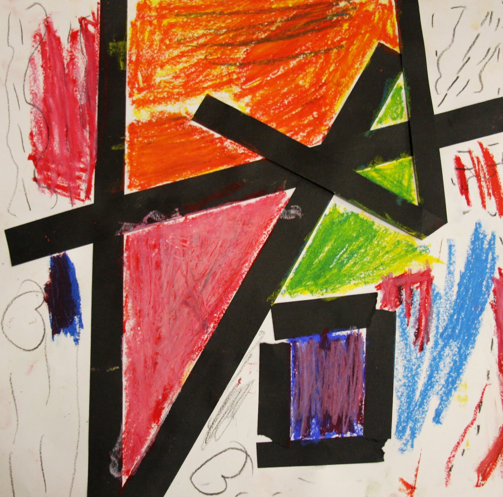
The construction of large, eye-catching triangles was another recurring theme. Don't you love the blending of oranges in the work on the right?
Instead of having the students create a Mondrian-esque study, I chose to allow for as many different solutions as possible within the perimeters of our materials. We spent a short time talking about his work, and mainly talked about the key elements of the compositions. I wanted the students to use similar elements as a starting point, but really take them in their own direction.
For their first lesson, students were given black paper lines in various widths which they could rip into smaller pieces or use whole, arrange and glue in any configuration. For the second lesson, they were given oil pastels in a variety of shades of red, yellow and blue, which they could choose to mix or leave pure. Because of the diversity of the final works, I thought it would be interesting to arrange samples here in thematic groups. Enjoy!


Some students chose to create a completely primary-colored composition, a pallet similar to that used by Mondrian. The primary colors are so striking when used side-by-side, aren't they?


Other students chose to mix all of their colors, and filled their compositions with secondary colors and neutral tones. There was a lot of experimentation and discovery as students found out through trial and error what exact color each combination of primaries made. For example, a light blue and red make a soft lavender, while a dark blue and a red make a deep violet!


Some students used the lines to construct recognizable objects or figures - such as a playful group of monsters, a monster truck, and a house.


Others organized meticulous vertical and horizontal grids, also reminiscent of the many squares and rectangles in Mondrian's work.


There were also artists who chose to organize their lines side by side instead of having them intersect.


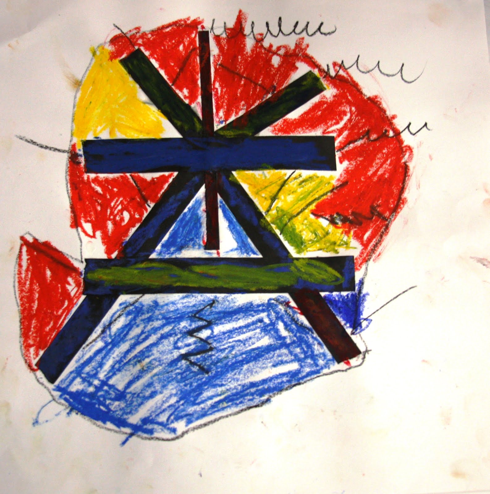

These radial designs popped up in many classes - comprised of diagonal, horizontal and vertical lines converging at one point, positioned in a central spot on the page. These compositions had a strong sense of balance and symmetry.


The construction of large, eye-catching triangles was another recurring theme. Don't you love the blending of oranges in the work on the right?


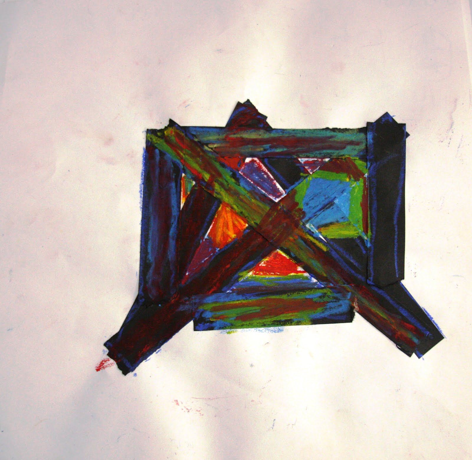
I found these "clusters" to be especially interesting. Though constructed of straight lines and some sharp angles, the overall effect feels organic, natural, even figurative!


These colorful, busy compositions are festive and full of movement - like confetti flying through the air!


There were so many different ideas, approaches, and final results. The students had such a great time exploring line and discovering new colors while making compositions that really reflected each student's unique vision!
Your lesson has made me think about Mondrian in an entirely new way! Thanks! :)
ReplyDelete